Charts & Terminology

There are three primary types of charts: Line, Bar, and Candlestick.
I’ve primarily used line charts because they are the most common; if you Google any stock right now, you’ll likely see a line chart showing its performance over time. It’s easy to see why: they are simple to digest and effectively signal where the price is heading. While I have seen candlesticks in the past, I’ve never used them to make trading decisions.
Chart & Trends
As mentioned, line charts are popular due to their simplicity. While we can use them to determine high-level trends, I want to introduce the bar chart to better illustrate concepts like uptrends, downtrends, support, and resistance.
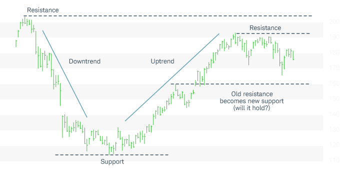
- Support: This is the "lowest" a stock tends to go—consider it the "ground" level for a stock's price. This doesn't mean it cannot drop further, but it represents a point where "stability" is difficult to break. This typically occurs when selling pressure exhausts itself, allowing buyers to take control.
- Resistance: This is the opposite of the ground; it’s the "ceiling" or the highest a stock will likely rise in a given period. Similar to support, resistance isn't an absolute limit, but it can be challenging for the price to break through. At this point, buying momentum often slows, and sellers begin to regain control of the price action.
So, when support or resistance begin to shift, we get uptrends and downtrends respectively. An uptrend indicates upward movement over time with higher highs and higher lows. A downtrend is the opposite of that, downward movement over time with lower highs and lower lows.
Moving Average (MA)
A moving average can be easily calculated over a period of time and close price. Moving Average (MA) can be used as a tool to help us determine the trend a stock will take.
Personal Example ($NKE)
In my last post, I shared that I have an open call option for Nike ($NKE) that expires on January 23 with a $63 strike price. This makes my break-even price $63.88 after accounting for the premium paid. To analyze the outlook, I’m looking at the Moving Average for Nike over both the one-month and 5-day timeframes.

The MA is ~$63.55 when looking at the last month's closing price data (December 2, 2025 - Jan 2, 2026)
https://www.nasdaq.com/market-activity/stocks/nke/historical?page=1&rows_per_page=10&timeline=m1
Looking at the one-month data (December 2, 2025 – January 2, 2026), the MA is approximately $63.55. Since the closing price on January 2 was below this one-month average, it suggests the stock could continue its downward trend when the market opens on January 5.
If I were relying solely on this one-month timeframe, the "smart" move might be to take my current profit of $104 and walk away. However, because the contract doesn't expire until January 23, I’m inclined to hold and continue monitoring the price movement. Interestingly, when looking at the last five days, the MA is roughly $62.06, which suggests a potential move upward.

Applying the support terminology, I noticed a support level at $57.22 on December 22. If this support holds, I expect the trend to move upward—as it has over the last five days—and reach a new point of stabilization.
Final words
I don’t know exactly what will happen as I begin this journey, but understanding charts and Moving Averages gives me a much clearer idea of what to expect. I’m curious to see if we hit resistance next week, especially since weekend news can impact the market on Monday.
I will continue using Nike as my primary example since it is my current open contract; its performance will help me decide whether to let the contract expire or take my profits. In tomorrow’s blog, I’ll continue the conversation on moving averages, patterns, and entry/exit points.
Member discussion